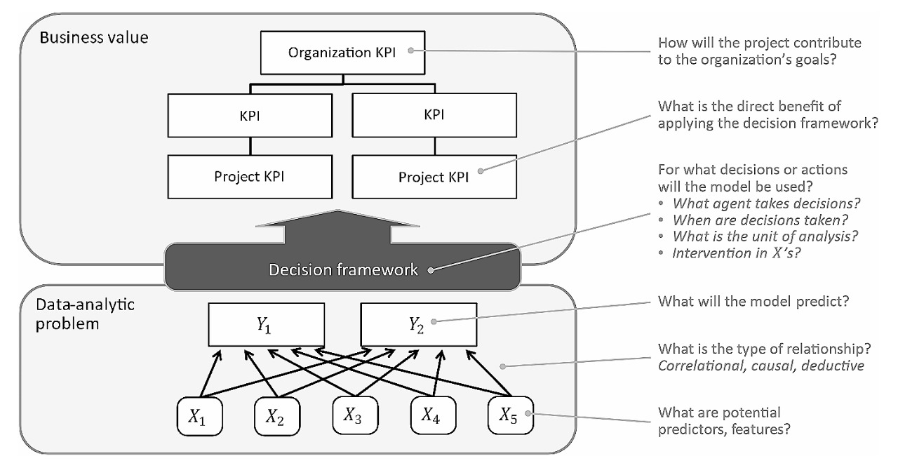
Perspectives on data science
Books
Introduction to Statistical Learning
Python for Data Analysis
R for Data Science
Interpretable ML
Time-series forecasting
Deep Learning
The Turing Way
Perspectives on data science
RIP correlation. Introducing the Predictive Power Score.
The Precision-Recall Plot Is More Informative than the ROC Plot
Stop aggregating away the signal in your data
The Design Philosophy of Great Tables
Modern, hybrid, open analytics
Getting into Python
Effective Python and idiomatic pandas
Getting into Python with RealPython.com
A Whirlwind Tour of Python
Data visualization with Vega-Altair
Exploratory data analysis with Altair
Amazing Altair with an even better theme
Comet charts in Python
Visualization curriculum with Altair
Altair’s data types
Altair’s visualization grammar
What is Altair?
Use cases & applications
Inzicht in energiearmoede
Predict precence of wolf pairs in Germany with XGBoost and SHAP
Verkeersveiligheidmodel
Notebooks
Demonstration of overfitting and underfitting
Predicting house prices with pycaret
Deconfounding explained
Predicting diabetes with pycaret
Categories
All
(7)
data engineering
(1)
exploratory data analysis
(2)
performance metrics
(1)
visualization
(2)
Perspectives on data science
The Design Philosophy of Great Tables
visualization
We’ve spent a lot of time thinking about tables. Tables—like plots—are crucial as a last step toward presenting information. There is surprising sophistication and nuance in…
Rich Iannone and Michael Chow
Apr 4, 2024
Modern, hybrid, open analytics
data engineering
As a Python data user, I’ve wanted a more modular, composable, and scalable ecosystem.
I think it’s here
. Wes McKinney released pandas c. 2009 to bring dataframes into…
Cody Peterson
Jan 25, 2024
Getting into Python
How to get into Python, the most widely used programming language for data science.
Daniel Kapitan
Dec 21, 2023
Data visualization with Vega-Altair
I am a big fan of the Vega-Altair ecosystem for data visualization, because it not only helps me in creating appealing, interactive visualizations, but it also helps me to…
Daniel Kapitan
Dec 21, 2023
Stop aggregating away the signal in your data
exploratory data analysis
visualization
By aggregating our data in an effort to simplify it, we lose the signal and the context we need to make sense of what we’re seeing. Originally published on <a…
Zan Armstrong
Mar 3, 2022
RIP correlation. Introducing the Predictive Power Score.
exploratory data analysis
We define the Predictive Power Score (PPS), an alternative to the correlation that finds more patterns in your data. Originally published on <a…
Florian Wetschoreck
Apr 23, 2020
The Precision-Recall Plot Is More Informative than the ROC Plot
performance metrics
An introduction to performance metrics for binary classification. Originally published on <a…
Paul van der Laken
,
Daniel Kapitan
Aug 16, 2019
No matching items